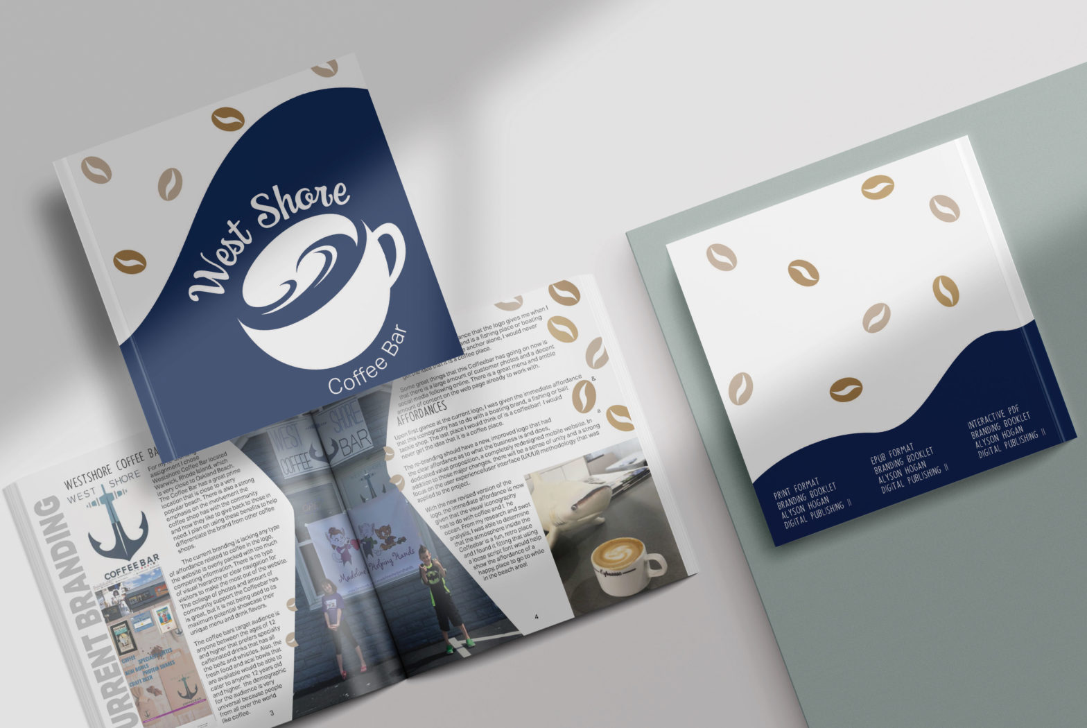
For this project I was tasked with rebranding a local coffee house in Rhode Island. The re branding should have a new, improved logo that had the clear affordance as to what the business is and does, a dedicated value proposition, a completely redesigned mobile website. In addition to those major changes, there will be a sense of unity and a strong focus on the user experience/user interface (UX/UI) methodology that was applied to the project. For my rebranding assignment I chose Westshore Coffee Bar located Warwick, Rhode Island, which is very close to Oakland Beach. The Coffee Bar has a great prime location that is close to a very popular beach. There is also a strong emphasis on the involvement the coffee shop has with the community and how they like to give back to those in need.
The coffee bars target audience is anyone between the ages of 12 and higher that prefers specialty caffeinated drinks that has all the bells and whistles. Also, the fresh food and acai bowls that are available would be able to cater to anyone 12 years old and higher. the demographic for the audience is very universal because people from all over the world like coffee.
From my research and SWOT analysis, I concluded that the customer UX/UI should give a clear, straight to the point affordance. This is what we do and the reason why we do it so well is because we have narrowed down and focused our menu on what counts, our customer’s feedback! While the inside of the coffee shop is retro with a clash of modern surfer feeling to it there is some a beach attire and decor that hangs on the wall like surfboards and skateboards.
Additionally, there is large connection between Westshore Coffee Bar, their customers, and their community. The community have had such an impact on the coffee bar that they have been looking into expanding to an additional location on the East Side, a Java Garden for the community to be able to gather to host fundraiser for those suffering with leukemia in the Warwick area.
My SWOT analysis in research has helped me narrow down the strengths weaknesses opportunities and threats that my brand is in will face. I see these weaknesses and threats as simple limitations that should be changed an improved upon so that I can create a new improved strong local branding that will become a new staple in the coffee community.My goal for this rebranding is to create an improved logo that has a clear affordance to as to what it is and implies. the website will have a clear navigation with easy-to-follow wayfinding signs to enable the visitors on the site to achieve any spot on the site within five to six clicks or less. The social media will be highlighted in the customer reviews are to be brought into the spotlight to help increase the brand loyalty and recognition.To further aid in the user experience/user interface at the coffee bar a new loyalty and brand ambassador program will be started to help bring awareness to those in the community that needs it. This type of UX/UI improvement has a lot to do with the proper use of content marketing in ways that it will increase the customer base, and overall quality for the new branding.The redesigned website will have a great user interface that will increase traffic and have merchandise sales online. The site will also be responsive and able to be viewed on any platform with little to no effort. The navigation menu will use proper way-finding techniques, along with targeted call to action and proper usage of graphics to make pages at the web that visitors want to stay on longer. By having a redesigned retro meets modern vibe to it, the website creates a sense of unity and an
What is UI/UX?
User Interface (UI) and User Experience (UX) are some of the most important aspects in app, product, and website design. The way a user will navigate your website and the readability, useability of the website will be very important.
UI stands for User Interface, which is considered the actual layout of a product or application. It focuses on the typography, visual elements, colors, buttons, and anything else the user may end up interacting with. It also focuses on the way it is designed in the layout. It almost always goes hand in hand with the UX of a product/app.
UX stands for User Experience which is how a user’s experience using a product or app is determined by the way they interact with it. It can be determined by the level of difficulty a user has while interacting with the UI. The UX determines the actual structure of the UI and the way it functions. Another way to look at is that when someone is using a product with ease and has no complicating factors or problems than the UX is good. However, if the product is hard to navigate and is creating a bad feeling for the user then, it would be considered a bad user experience. UX design looks at a variety of ways to approach the solution to a problem. It works in a collaborative process with the user interface to create a visually pleasing solution.
Current Branding
For my rebranding assignment I chose Westshore Coffee Bar located Warwick, Rhode Island, which is very close to Oakland Beach. The Coffee Bar has a great prime location that is close to a very popular beach. There is also a strong emphasis on the involvement the coffee shop has with the community and how they like to give back to those in need. I plan on using these benefits to help differentiate the brand from other coffee shops.
The current branding is lacking any type of affordance related to coffee in the logo, the website is overly packed with too much competing information. There is no type of visual hierarchy or clear navigation for visitors to make the most out of the website. The college of photos and amount of community support the Coffeebar has is great, but it is not being used to its maximum potential showcase their unique meu and drink flavors.
The immediate affordance that the logo gives me when I look at it, is that the brand is a fishing place or boating supply place. If it was the anchor alone, I would never get the idea that it is a coffee place.
Some great things that this coffeebar has going on now is that there is a large amount of customer photos and a decent social media following online. There is a great menu and amble amount of content on the webpage already to work with.
Re-Design Logo & Branding
Affordances
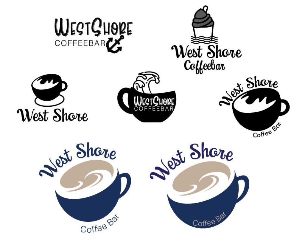
The re-branding should have a new, improved logo that had the clear affordance as to what the business is and does, a dedicated value proposition, a completely redesigned mobile website. In addition to those major changes, there will be a sense of unity and a strong focus on the user experience/user interface (UX/UI) methodology that was applied to the project.
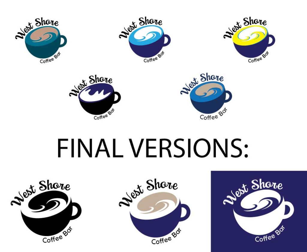
With the new revised version of the logo, the immediate affordance is now given that the visual iconography has to do with coffee and the ocean. From my research and swot analysis, I was able to determine that the atmosphere inside the Coffeebar is a fun, retro place and I found it fitting that using a loose script font would help show the affordance of a happy, place to go to while in the beach area!

