Client: Recyclo-Bot Logo
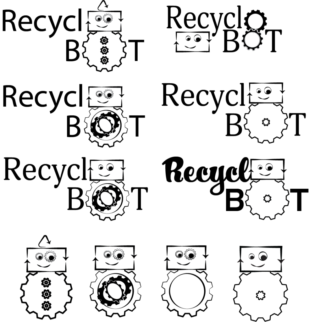
While there are many different things I would have liked to include with my recycling character, I knew that it would have to be simple enough for anyone to be able to understand but also not so complex that it would become unreadable or illegible upon becoming a smaller size. Plus there have been tons of different versions of recycling projects, fundraisers, and companies that I knew my logo had to be something unique to stand out and differentiate itself from my competitors and other recycling programs. I choose to replace the letter “o” in recycle. Instead of the “o”, I concluded that replacing these would increase the contrast and draw the viewer’s eye to the typography. Thus, giving it the immediate affordance that my character feature is your recycling robot friend!
I decided that using a square rectangle for the head with two different size gears for eyes would make a creative character face that would give the immediate affordance that the robot was glad to be recycling! Additionally, I added a large gear with smaller gears inside of it to show that he is a robot that is made from recycled parts and pieces. There are a lot of things that go into recycling so it’s always a moving part which is how the gears tie into recycling.
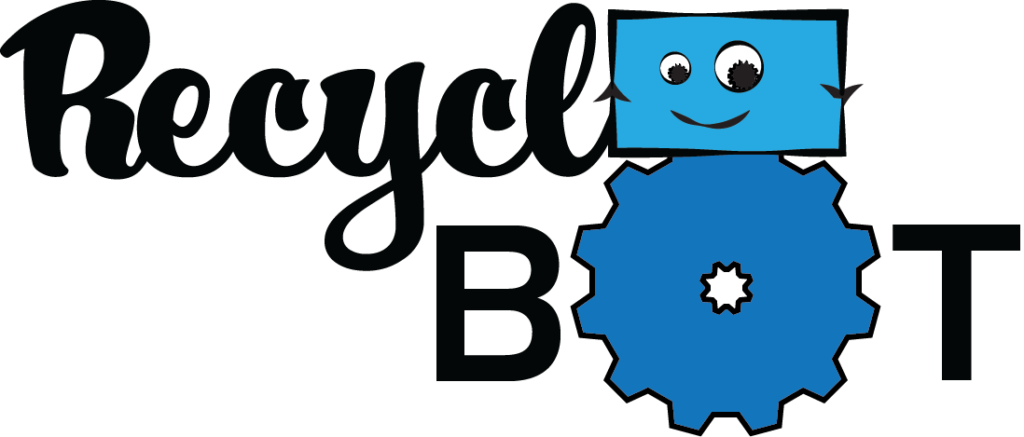
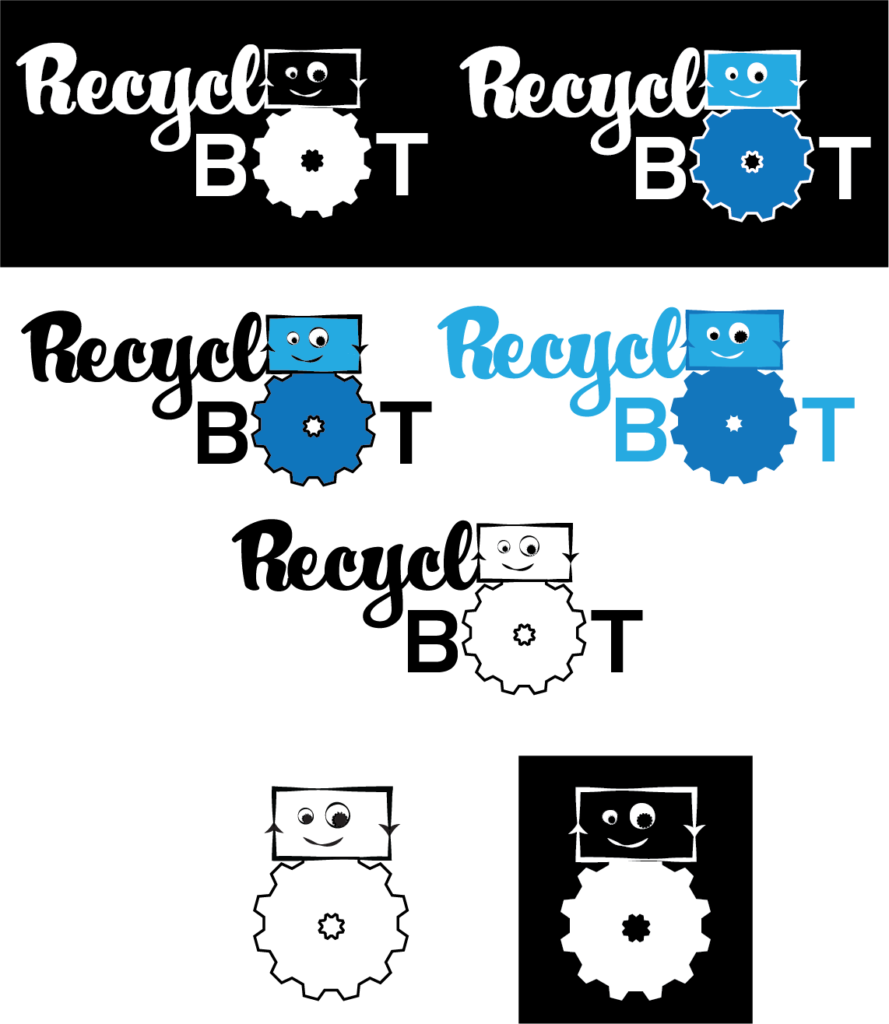
I chose to use two different types of fonts for the logo. The first font is a form of a serif-script font that is connected to look like cursive handwriting. The second font is called Strenuous, it is a medium weighted san-serif that pairs well with the playful curly font. The reason I choose to use the script font first is so there was a level of hierarchy to each word, “recyclo” and “bot”. It reminds the targeted audience and viewer that although it is a playful, and fun project to build together, that recycling is important and makes a big impact in our everyday lives.

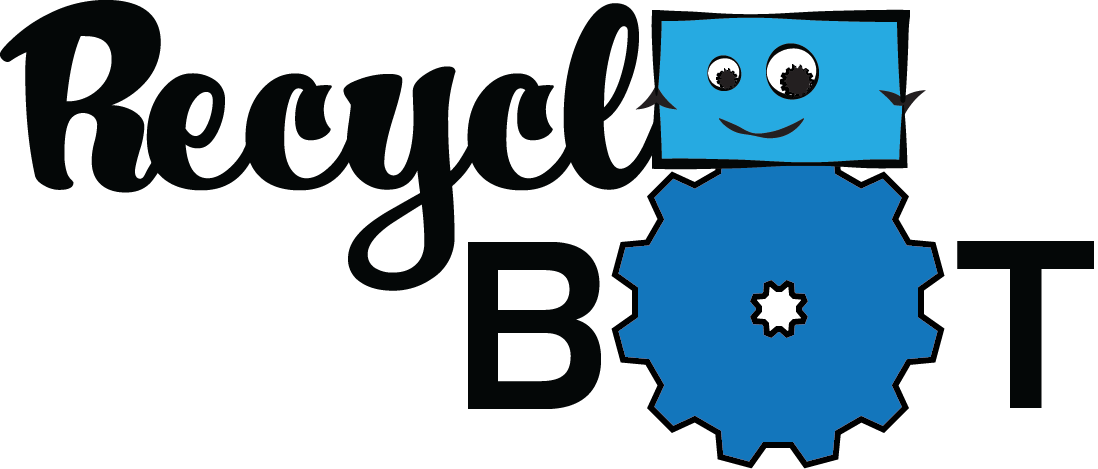
After gathering the required details and research on recycling and robots, I concluded that using multiple shades of blue will work best with my design. Most recycling projects and designs have some type of green colors or hues throughout the designs, which works good with our brain connections and patterns. However, I feel that blue has the sense of loyalty, faith, confidence, and trust that I want people to feel and/or represent when thinking about my Recyclobot project and logo. Additionally, blue also represents the sky and sea which can both benefit greatly from recycling and reducing the impact we have on the environment! Ultimately, I decided that the darker shade of blue worked best for the body of the character because that shade of blue has a feeling of trust and is also one of the colors that reminds many people of recycling. I used the lighter shade of blue for the inside of the head and face because it shows a level of visual hierarchy to the character feature.

I wanted to use the three arrows since it was a well-known symbol for recycling worldwide. However, it was not special enough in my opinion, so I decided on using an arrow in the similar triangular shape to represent the bot’s party hat because all kids love a fun time! Additionally, the other two arrows were used to help make up the shape of the robot’s head. Lastly, for the body I decided that one solid colored gear would be best to represent the buttons.
